


If your brand colors are starting a lil’ stale, boring or flat…or your stuck layering them the same one or two ways every time…this blog post is for you.
If your brand colors only work on a white or black background (and nowhere else in your palette), you probably need one darker and one lighter supporting tone.
Because here’s the dealio – you don’t actually have to start over.
You just need to expand your color palette.
“But Carrrrrrllllllll…what do you mean expand them?”
Lemme explain. So many brands start with a tight palette. Usually two or three core colors – the primaries that show up everywhere. We need those. Don’t dump ’em. But after a while, they start to feel… a lil’ flat. Right?
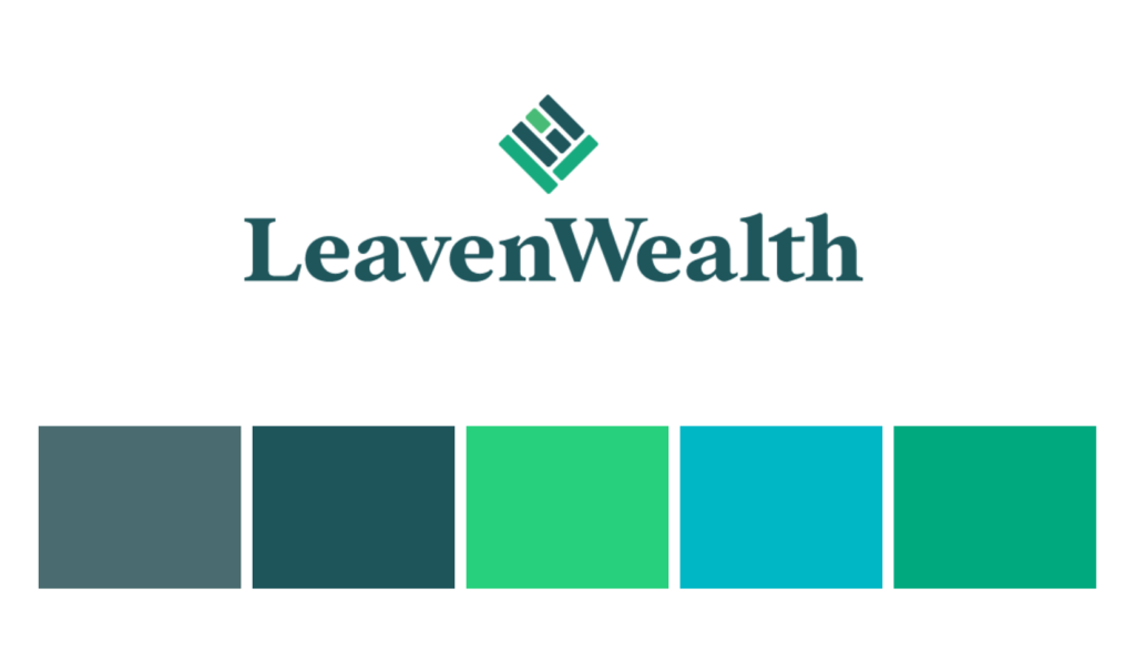
I recently helped LeavenWealth with their website redesign which included an updated color system, and this is a great example of what I mean.
Here’s what their original color palette was:

Their website is ‘on brand’, but it felt combative. Like they were fighting for attention instead of working together. And it begins to feel like the sea of same – there’s not much room to really pack a punch with that teal when all the colors are trying to pack the same punch. Know what I mean?
So I expanded the color palette. Here’s what I added:

• I swapped the dull gray-blue for a deep navy to boost contrast while staying in the same color family.
• I brightened one of the teals (#42BABF) so it could sit on top of the darker blue and stay legible.
• I added a soft mint tone so the sea foam green didn’t feel so heavy.
• And I expanded the cream tones to lighten the overall palette.
Here’s what their website looks like now:

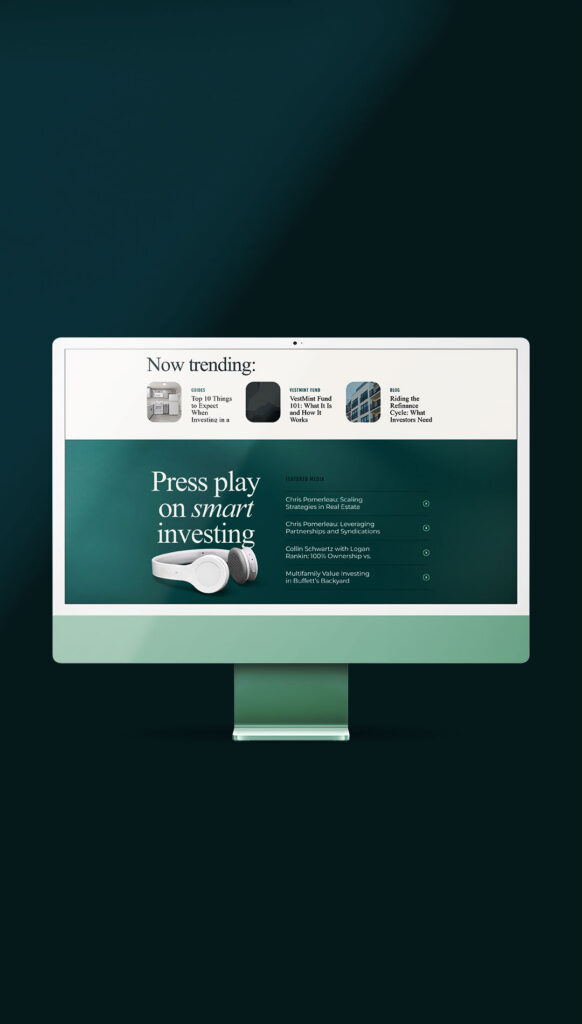


And two things happened immediately:
• the contrast improved (which makes everything easier to read)
• the original teal actually stood out more
So now the brand feels richer, fresher, and waaaayyy more layered without reinventing the entire brand colors.
Sometimes a brand refresh isn’t about starting over. It’s just about giving your existing colors more room to breathe.
If you’re doing a lil’ spring cleaning for your brand, this is a great place to start.
🌸 Grab the Brand Spring Cleaning Checklist and see what parts of your brand might just need a refresh.
If you’re ready to refresh your brand this season (or any season) be sure to book a call!


Read the Comments +