


5 Festive combos that spark sells – without screaming Santa.
Before we dive into the merry magic of color palettes, quick Q:
Have you joined Brand Sleigh yet? It’s my mini-course that helps you sleigh your holiday visuals with strategy. If your brand usually hits December looking like a Pinterest board gone rogue – this is your pre-party warm-up.
Aight, let’s talk color.
If you’ve ever stared at a blank Canva screen wondering “Can red and green ever look cool?” This one’s for you.
Because yes, holiday marketing should feel festive. But also? It should still look like your brand.
Your color palette sets the tone for your whole offer, whether you’re promoting a product drop, a seasonal service, or a one-time bundle that’s more *unicorn* than evergreen tree.
So let’s ditch the cheesy graphics and dive into 5 holiday-inspired color palettes that bring the joy and the sales. Use these as inspiration for your brand colors, or use them as a separate fresh holiday campaign for your offer and brand.
- Modern Mistletoe
Colors: Forest Green | Cream | Gold Foil | Dusty Blush
This is your luxury lodge meets minimalist mood board vibe. Think cozy, elevated and a little unexpected.
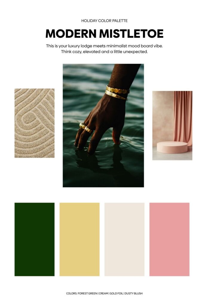
Best for:
– Designers selling templates
– Creative service providers with high-ticket offers
– Brands with a calm, chic tone
Pare it with: Elegant serif fonts, lifestyle photography, and gold accents (even if it’s just digital glitter).
- Merry & Bold
Colors: Cherry Red | Fuschia | Deep Navy | Bright White
This palette is holiday with a wink. Bold, fun, and ready to party without looking like a big box store ad.
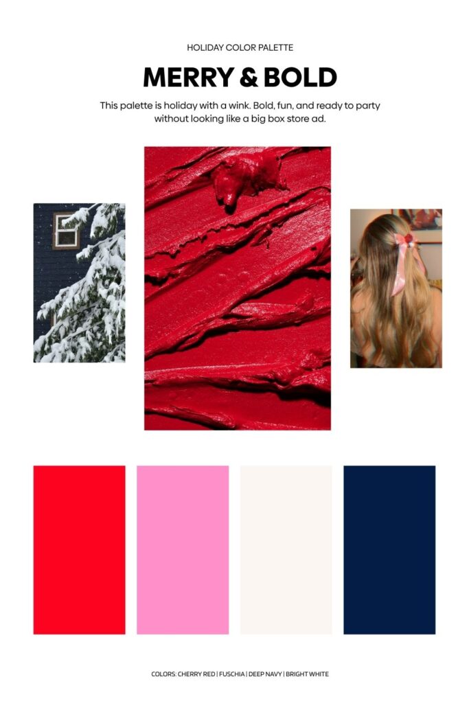
Best for:
– Content creators with big personalities
– Product-based brands doing holiday drops
– Promo graphics that need to stop the scroll
Par it with: playful fonts, bold product mockups, and GIFs that *pop*.
3. Snow Day Neutrals
Colors: Soft Gray | Oat Milk | Icy Blue | Warm Taupe
Not everyone wants to throw glitter. This palette whispers sophisticated winter magic and feels like the warm hug of a cashmere scarf.
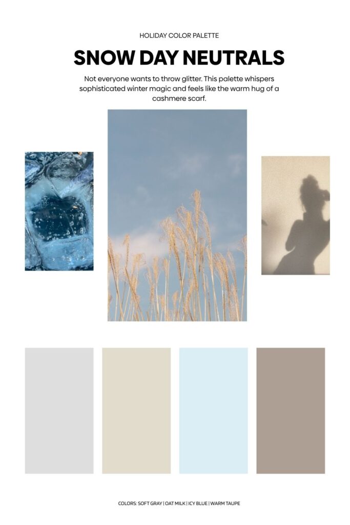
Best for:
– Service-based businesses
– Clean, minimal landing pages
– Digital products with cozy vibes
Pair it with: Sans serif fonts, clean layouts, and spacious design. Think less clutter, more calm.
4. Sugar Plum Vibes
Colors: Lavender | Mulberry | Silver | Midnight Blue
Whimsical. Dreamy. Slightly magical. This palette is holiday marketing with a fantasy twist.
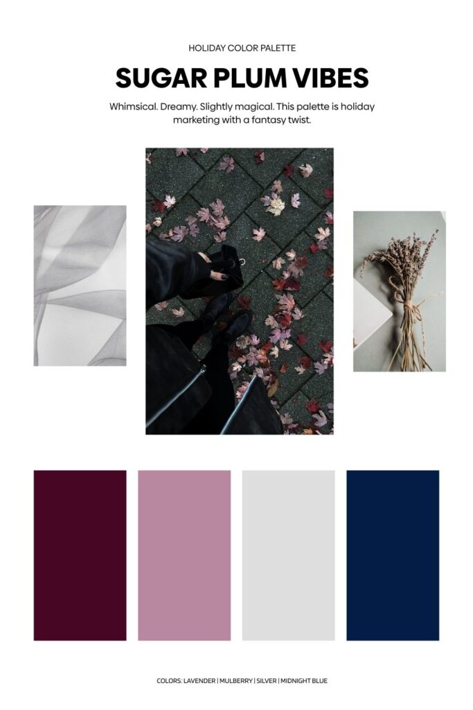
Best for:
– Creatives with mystical or artistic brands
– Photographers, illustrators, spiritual coaches
– Promo materials that lean dreamy over commercial
Pair it with: Handwritten fonts, organic shapes, and soft textures.
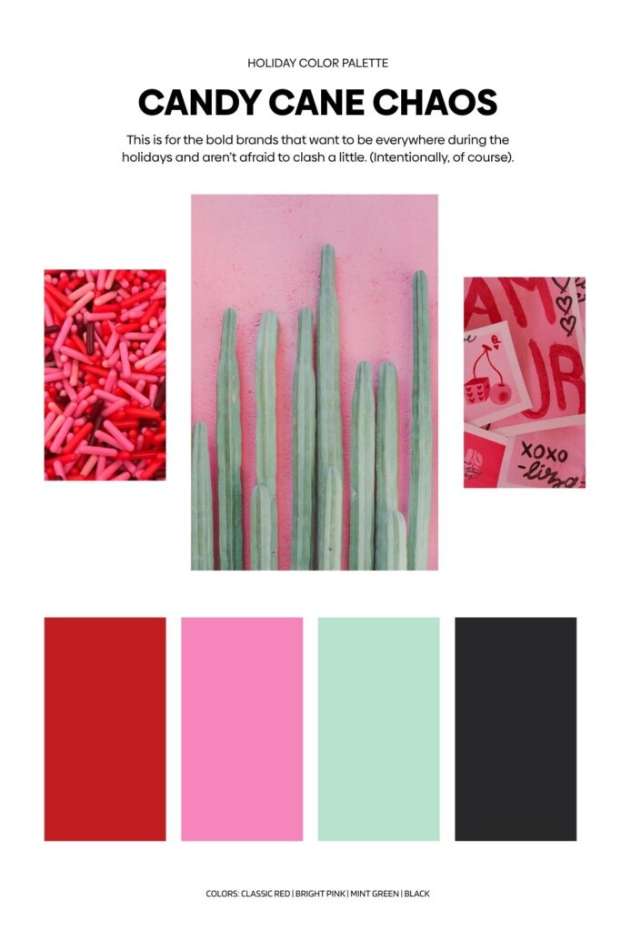
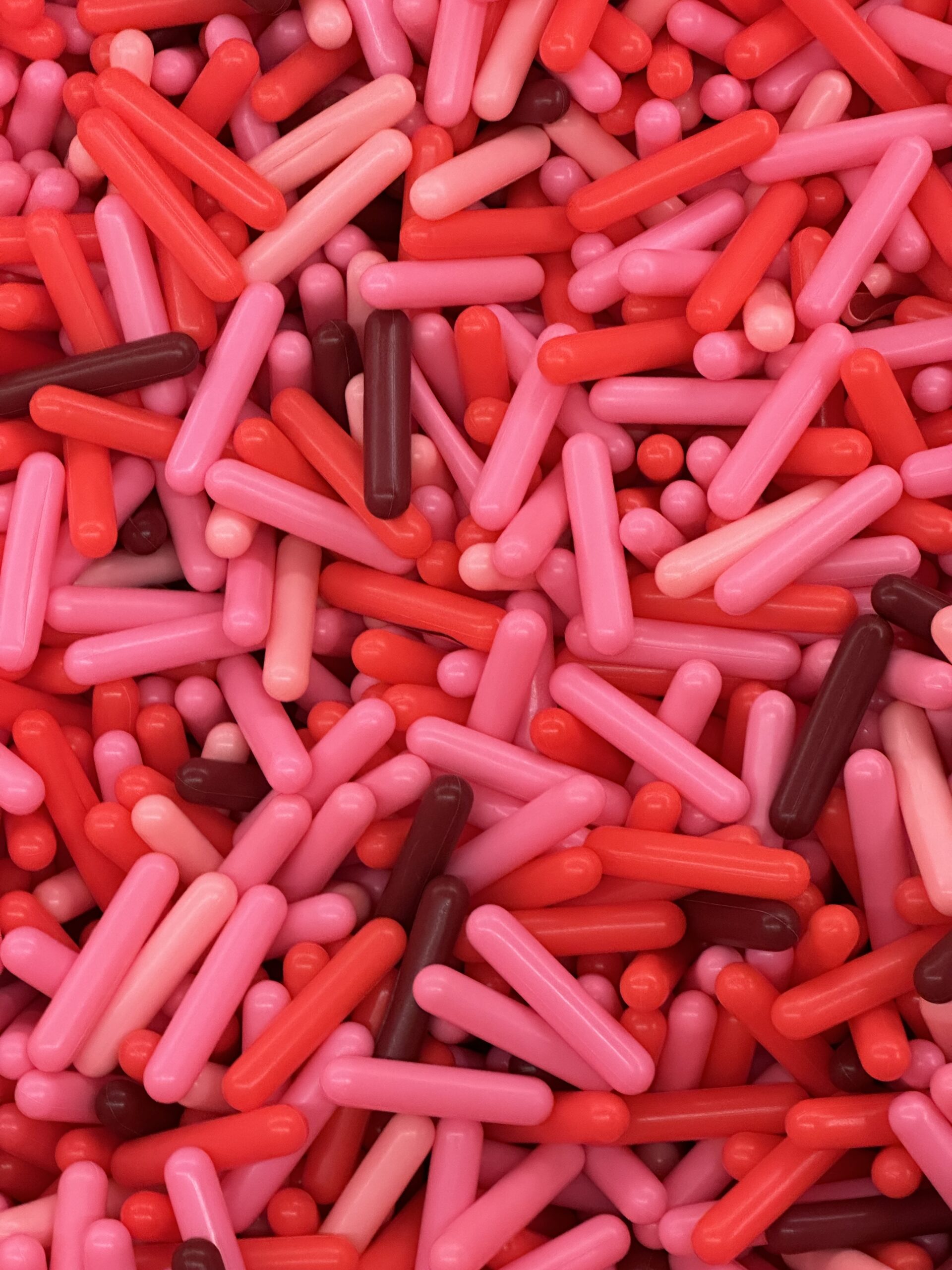
5. Candy Cane Chaos (in the best way)
Colors: Classic Red | Bright Pink | Mint Green | Black
This is for the bold brands that want to be everywhere during the holidays and aren’t afraid to clash a little. (Intentionally, of course).
Best for:
– Social-first brands
– Big Black Friday promos
– Digital shops with personality
Pair it with: Eye-catching text, loud headlines, and cheeky copy.
Color is strategy. Use it like a pro.
Holiday color palettes aren’t just about looking pretty, they’re about evoking an emotion, creating brand recall, and making your audience feel ready to buy.
So whether you’re full sparkle or snowy chic, choose colors that feel like you, align with your brand, but elevated for the season.
Want these palettes pre-made in Canva? Download the Holiday Color Palette Pack today. Get all 5 palettes loaded and ready for Canva with coordinating mood boards.
Or go straight to the source with Brand Sleigh – my one week mini course that shows you how to dress your brand up for the holidays that includes a mini marketing plan.


Read the Comments +