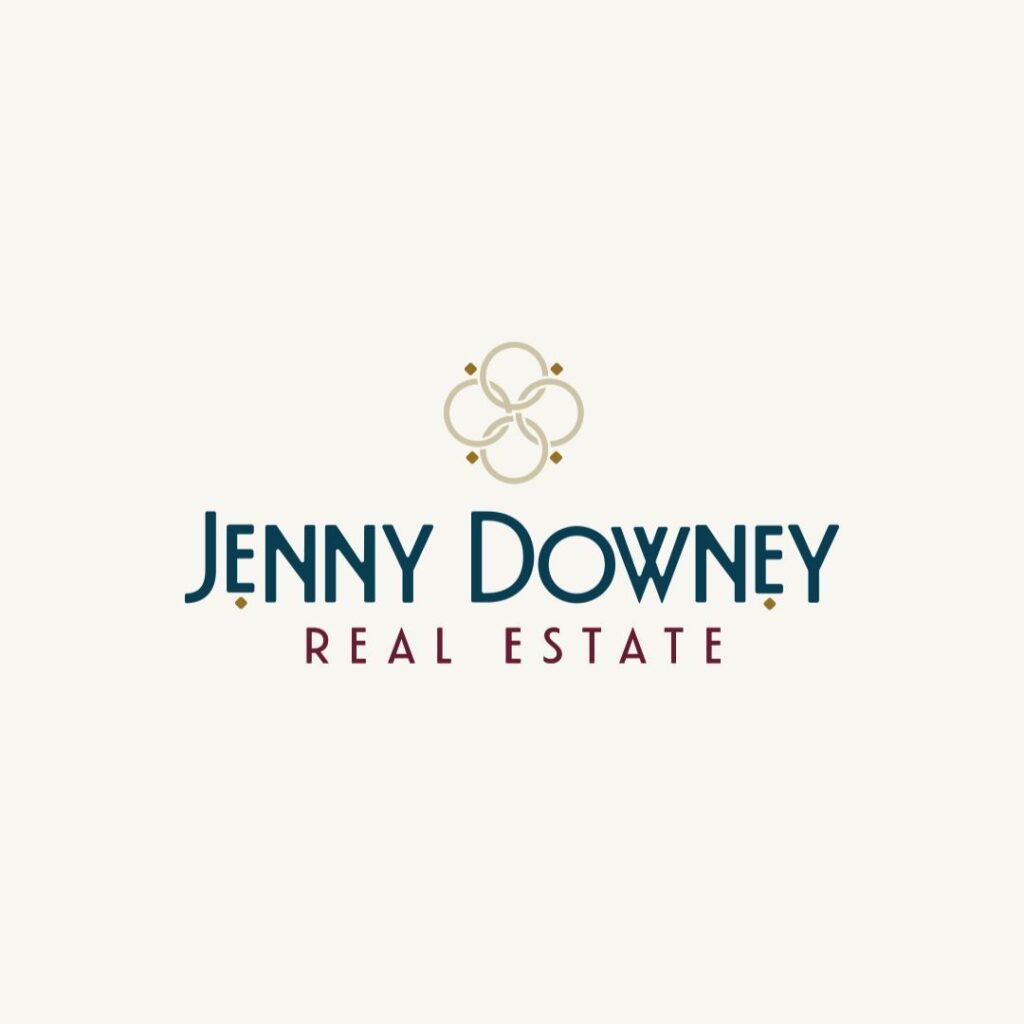
It’s a bit overdue on this one, but I’d like to introduce you to the new Jenny Downey Real Estate brand. We had a couple of twists and turns on our brand journey but we landed on a solid solution. One that she loves and feels aligned with which is always the goal with Hey, Carl!
Personally, my favorite thing about this logo is that there isn’t a house in it. I can’t tell you how many realtor logos I see that have houses in them. We know you’re a realtor, you don’t need a house in it or a key. Don’t pigeon hole yourself to look like everyone else.
You don’t need to have the thing you do in your logo. Can you have the thing you do in your logo? Absolutely. And it can work swimmingly, like the key we put in Jenny’s logo. Did you catch that? The logo mark is set to look like a vintage top of an old key. It fits her brand personality and brand direction, speaks to her industry and herself but doesn’t look like everyone else.
If you’re not careful or strategic about it – you’ll wind up looking just like the realtor next to you and that just kinda sucks.


Read the Comments +