


Fonts are a playful way to create a vocal tone and experience. When you’re reading something and a word or sentence is in bold, italic or all caps, you change the inflection of how it’s read. The same goes for types of fonts as a whole. A story written in a scripted font is going to present differently when written in a serif or sans serif font. Not sure on what that all means? I got you covered. There are hundreds of thousands of fonts out there, but for the most part, they all fall under a handful of categories. I’m going to show you the top 5 types of fonts that are the most common.
 source: www.designbolts.com
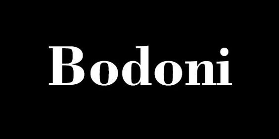
Serif fonts: refer to the serif on the letters in the font family. A serif is a line that extends past the body of the letter. For instance, the ‘d’ in Bodoni has a line at the top of the d and the bottom of the d that extends past the letter. That little guy is a serif.
Where and how to use this font
Basically anywhere. Serif fonts were used primarily for print back in the day to help with legibility. As technology grew and the screen was introduced into our world, serif fonts were found to be a little harder to read. But that’s not to say it can’t or shouldn’t be used of digital and screen designs. Considering that this is a pretty traditional font, it work really well with formal, elegant, luxury and classic brands. Serif fonts work great as body text and header text, primary or secondary fonts.
 source: www.crazyleafdesign.com
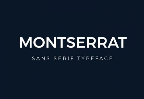
Sans Serif fonts: The same as a serif font except minus the serifs. Clean lines that typically have the same width throughout the font.
Where and how to use this font
I can’t decide if I like sans serif or serif fonts more. I personally feel I lean a little heavier on the sans serifs. But, they’re both beautiful fonts that are solid staples in any brand. So where and how do you use a sans serif font? Basically anywhere, just like with serifs. You can use this for print and digital, for your main body copy or for secondary fonts for your headers. One thing to consider when it comes to choosing your fonts, is understanding who your target market is. If your main market is 60-80 year olds, using a serif font as your main body text would probably be best. Mostly because it’s more legible for older eyes and the tone of the font is probably more relatable to them too. Not always, though! Just understand who it is you’re talking to.
 source: www.creativebloq.com
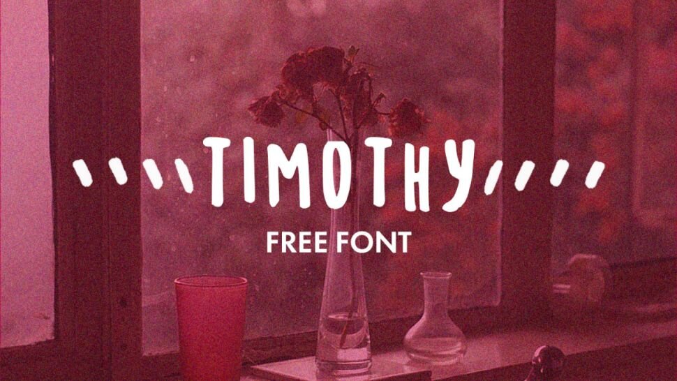
Handwritten: these fonts typically have a playful tone to them. They don’t have to be cursive, swirly or messy. They just have to have a feeling as though someone wrote the letters down themselves.
Where and how to use this font
Because of the tone that these types of fonts offer, they’re best place is an additional element to your brand. I wouldn’t recommend to use handwritten fonts as a main body copy font for a few reasons. Not only can they can be really hard to read, but they can also cause overwhelm for your readers if there’s a lot of it in one setting. The point is to get people to read your content, not have to work to read it, right? Using handwritten fonts look awesome as signatures, 1-5 word elements like adding notes to your designs, headers, invite designs etc.
 source: www.fontbundles.com
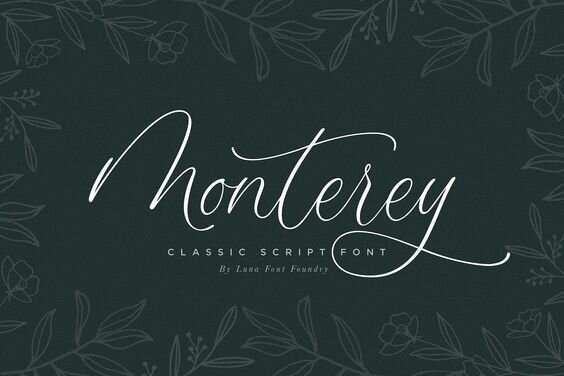
Calligraphy/Script: I call this the fancy font. These can be handwritten fonts, too, or more refined. Both fit in this category.
Where and how to use this font
Just like handwritten fonts, calligraphy/script fonts can be really hard to read. That said, they still make for great elements in design. The best way to use this font is for headers, signatures, fancy invites, texture/background designs etc. Keep in mind, if you use this font as body text for your readers, try to pick one that’s easy to read. If you’re making your audience work to read your copy, you’re going to lose their interest pretty qua
 www.fontbundles.com
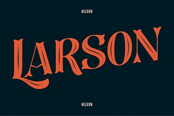
Display/Decorative: these are also fancy fonts but they’re built even more unique. They have A typeface that’s not meant for every business or brand and used to lead the viewers in.
Where and how to use this font
As mentioned above, display fonts are typically designed to lure viewers in. The best way to use this type of font is for CTA’s (call to action), headers/headings, and anything that you want to be all things big. This type of font is not intended for large body text/copy.
Choosing the right type of font
Now that we’ve gone through the main categories of fonts, you might be wondering how you choose fonts to represent your business and brand. There are a few rules that go with this, but for now we’ll keep it simple. I always recommend having a serif or sans serif font intended for your body copy. From there you can add 1-2 more fonts. One being used for headings and sub headings, the other being for display and fancy elements that you can sprinkle in your designs.
The key to choosing the right fonts for your brand is to understand who your target audience is and what your brand personality is. If you’re not sure, let’s connect!


Read the Comments +